

Classic portrait study
An 8×8 square grid divides the head into cells small enough to place the eyeline, the nose base and the mouth by measurement rather than by feel. Red lines carry the most contrast against skin tones.
Gallery · Worked examples
Six reference photographs, each shown twice — bare, and under the overlay an artist would actually reach for. Drag the divider on any one of them to wipe between the two, filter down to the grid type you are studying, and take the reference away with you.
These are demonstrations on royalty-free reference photography, not submitted artwork.
The same photograph on both sides of the divider. What changes is the overlay laid on top of it — which is the whole question when you are choosing one.
An 8×8 square grid divides the head into cells small enough to place the eyeline, the nose base and the mouth by measurement rather than by feel. Red lines carry the most contrast against skin tones.

Dropping the horizon onto the upper third line hands two-thirds of the frame to the sky, and the peak lands on an intersection rather than dead centre.

A denser 12×12 division gives verticals something to be checked against, and keeps window spacing and cornice runs consistent across a facade.
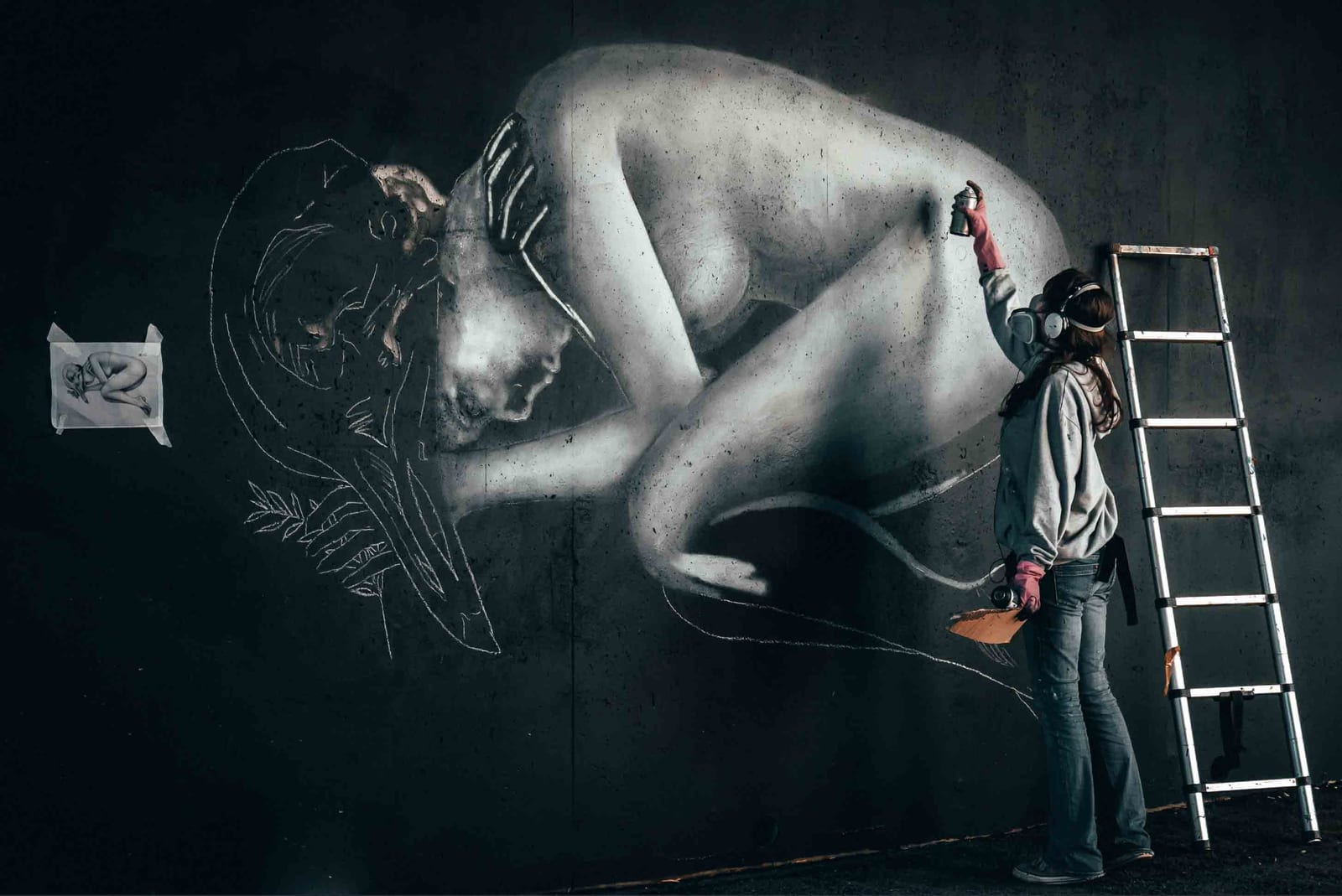
A 10×10 division makes the head-to-body count legible — roughly seven and a half heads on an adult figure — and holds that count steady through a dynamic pose.
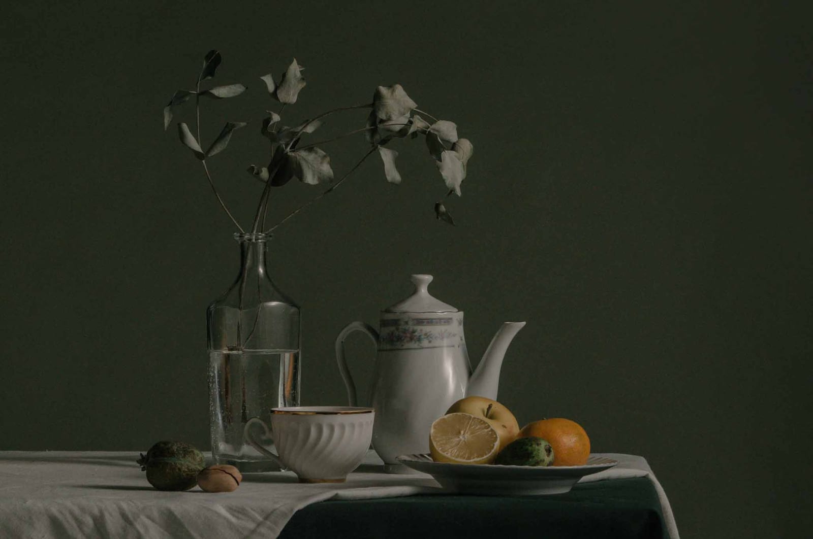
A coarse 6×6 division is enough to fix where objects sit relative to each other, without cutting the arrangement into so many cells that the shapes disappear.
Diagonals crossing the golden section at φ = 1.618 give the frame a set of anchor points that thirds cannot produce. The same armature editorial photographers use when a subject has to sit off-axis and still hold.
Load your own reference into the tool and pick a grid, or work through a structured lesson that names the overlay and the sequence for you.
Grid Maker Pro is used by artists, photographers, designers and educators — but their work is theirs. Nothing you make in the tool is republished or watermarked by us. If you want a piece shown in this gallery, one of these three routes puts it in front of us.
@gridmakerpro
Post on Instagram, X, Bluesky, Pinterest or TikTok with #gridmakerpro. Every tag gets seen, and standout work is featured with credit and a link back to your portfolio.
The direct route
Send a before and after pair with a one-line note through the contact form — permission to feature, your preferred credit, and a portfolio URL.
One piece per issue
Each issue picks one shared piece and writes a paragraph on which overlay was used and why. Back catalogue at the journal.
Illustrative composites of how the tool gets used in practice — not quotes from named individuals.
Sphere first, every commission. Ten minutes on the construction overlay saves a day of repainting.
Loomis, Reilly, Asaro — three construction methods, one tool. Students see all three on the same reference.
Even on rough thumbnails. The sphere + plane is fast to block in and tells me whether the angle reads three-quarter or near-profile.

Every overlay in the gallery is one click away. Free, browser-only.
Launch Grid Maker Pro →